Writer at Work and Play

Easy Update for a 1950s Bathroom
~ How to Make a 1950s Bathroom Look Fresh and
Sophisticated On a Budget and Without a Reno ~
Until the 1960s, pink was a prime choice for bathrooms. And until the 1980s, pink was considered a beautiful hue that was even suitable for men’s shirts and ties.
While pink is making a comeback for menswear, it’s making a slower return for bathrooms even while it’s one of the most flattering colors for all complexions. Martha Stewart created a beautiful pink tiled bathroom in her Skylands Home in Maine. But for the typical homeowner, a pink bathroom means an outdated little-girl room.
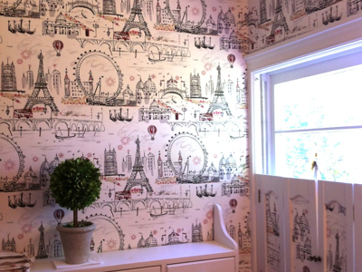
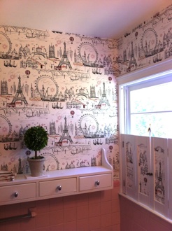
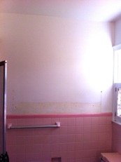
My master en suite bathroom is classic 1950s and ‘60s, when the master bath has a shower stall (allowing generous closet space in the bedroom) and pink tile. I could have done a gut reno as I have in my kitchen, living room and family room, but I want an easier fix here since I’m thinking about putting my home on the market; future buyers might consider structural changes and therefore look beyond expensive materials I bring in.
I considered tile paint for a white finish, but that looks cheap to my eyes and the duration of it in the shower sounds iffy.
Next, I thought about wallpaper—would an additional material give the room a lift? The answer is, yes! Beautifully. And instantly.
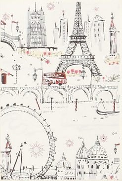
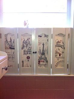
When I ran across “C'est Magnifique Wallpaper” from Anthropologie, everything fell into place. The Eiffel Tower motif fits perfectly with my home’s French theme, and its sketch-like design has artistry and cheer. The paper is a bit pricey, but the quality is superb.
This was my first time installing wallpaper, and I completed the room with two rolls in seven hours, saving $700 in installation.
Ever since the paper went up, I cannot stop smiling when I glimpse this room, and neither can my guests when I give them a tour. The paper invites people to linger over other European highlights such as Venice’s gondoliers.
The bathroom now looks fresh, polished and sophisticated, and the mood is cheerful and appealing. The fact that there is tile in the room is an after-thought. I took it as a compliment when a male friend remarked, “I don’t really care so much anymore that the tile’s pink. I barely notice it now.”
Charming.
A Pink Fact
Post-WWII, there was era of youthful optimism reflected in home design color. “Mamie Eisenhower’s favorite hue was pink; she filled rooms in the White House with the color, and soon homes across America followed suit,” write authors Leatrice Eiseman and Keith Recker in “Pantone: The 20th Century in Color” (Chronicle Books).
How To Get an Even More Au Courant Look:
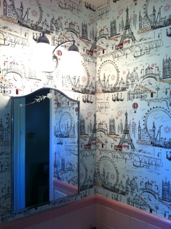
•Shine a bright light. This simple lighting fixture from Home Depot (around $40) is reminiscent of European street sconces, and makes the existing 1950s medicine cabinet harmonize beautifully with the new composition.
•Reinvent your shutters. Remove fabrics from frame-style shutters and replace with cuts of wallpaper applied to 1/8”-thick art board using a spray adhesive; gently wedge into place from behind. Shutters become frames for artful drawings.
•Install a horizontal storage cabinet to break up the wall flatness and to add a unique sense of furniture and handy storage.
•Add glint. Replacing wood knobs with polished stainless introduces an element of shine and additional texture and form.
5 Key Wallpapering Tips:
•Choose pre-pasted paper such as those labeled “SureStrip.”
•Go with a pattern, not a solid, to make a room look fresher and have more dimension, and to hide mistakes if you need to patch.
•Order extra paper for pattern matching.
•Acquire two inexpensive must-have tools: a wallpaper smoother; and a wallpaper blade that allows you to snap off 1/2" pieces so that you have a fresh blade for each cut to avoid rips and ragged edges.
-
•Only submerge in water the cut panel you’re applying each time, not the entire roll.
“C'est Magnifique Wallpaper” by Anthropologie
$88 per roll, covers 60.75 sq. ft.
http://www.anthropologie.com/anthro/catalog/productdetail.jsp?id=963130
Friday, September 21, 2012